Home of Domestic & Commercial Energy Performance Certificates, SAP ratings, Legionella Assessments and Floor Plans
We know the best way to improve your energy!
Get a quote now
Welcome to I & R Energy Assessors

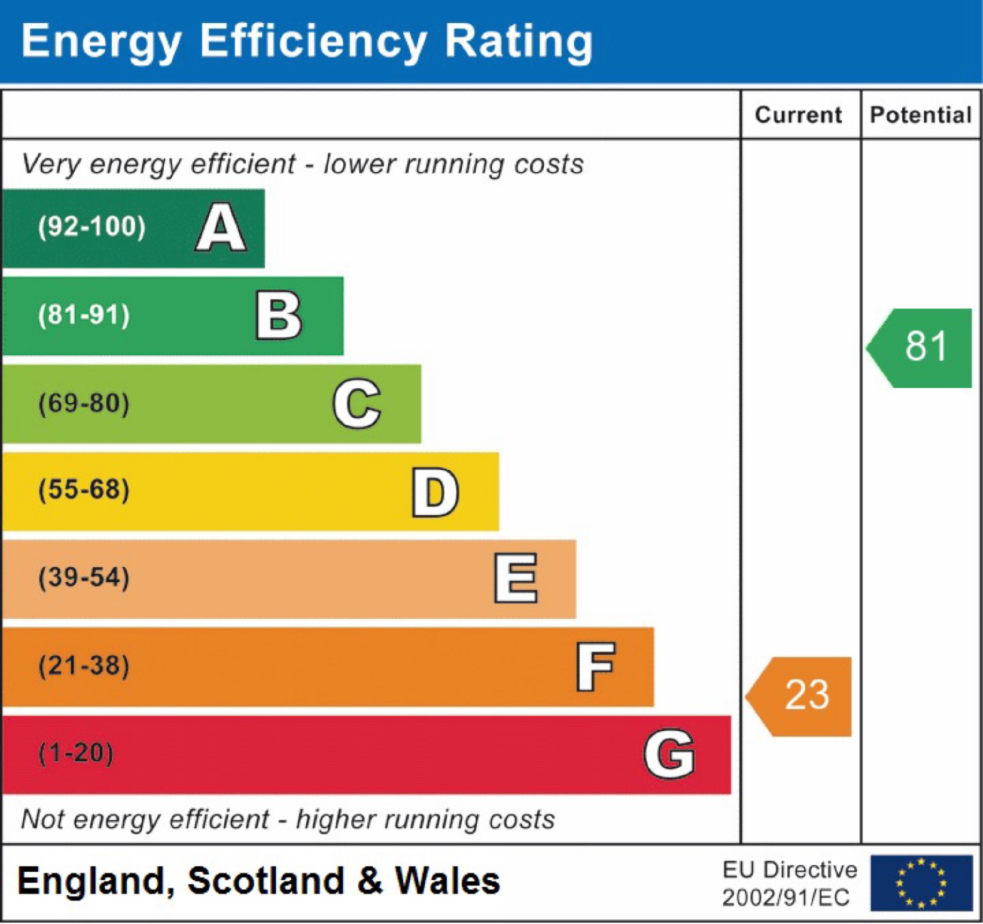
The Ratings Chart Explained

This is the headline message provided on page 1 of the certificate. Currently, this chart is colour coded in red/green.
The chart rates the home’s energy efficiency – that is, how much of what you pay for (heating, lighting and, hot water) do you get per pound spent on energy bills. This calculation is done per square meter of floor area so that different sized homes are rated on an equal footing. Otherwise, a smaller but less efficient home might rate more highly than a larger, more efficient one, purely because it has less space to heat.
The graph has two arrows – one indicating the home’s performance now, and the second showing the home’s potential rating if the most cost-effective recommended measures are all installed. This potential rating is very important – it tells you if the home is capable of being improved at a reasonable cost, and how much better it could be after improvement. The arrows are both numbered with the SAP rating, before and after improvement; SAP is just the technical name for the method used to assess the home’s energy performance. It’s the difference between these two numbers, rather than the difference in the rating bands, which tells you just how much the home can be improved.


